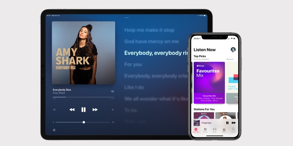
iOS 14 brings important new features like home screen updates, widgets, new privacy controls, and feature updates like Siri and HomeKit. But Apple has also taken the time to work on some pretty big feature enhancements for many of its core apps.
One of them is the Music application. Apple continues to compete aggressively against Spotify in the music streaming race, and iOS 14 goes one step further. These are the news of Music for iOS 14.
iOS 14: what’s new on Apple Music
First of all, Apple Music supports the new widget features of iOS 14. The Music app provides a Recently Played widget that features recently played albums and playlists. You can touch the widget to start the Music app and start playing the displayed music.
Something that is very common on Android is a Now Playing widget, which places the play / pause and next track buttons on your home screen. However, this type of widget is not compatible with the iOS 14 API, since widgets must start their main application when touched. Developers cannot add separate buttons. Apple may add a special Now Playing system widget, similar to what is available in the Control Center, but not present in the current beta.
The Music app also supports new AirPods enhancements, including automatic switching and headphone adaptations that can tune sound frequencies to an individual’s hearing.
These are the changes to the Music app itself:
Listen now

Apple has updated the For You tab in iOS 14 and now it comes with a new name: Listen Now.
One of the common criticisms of Apple Music by Spotify users is that playlists and discovery features are not that good. Listen Now is apparently trying to tackle that angle with an even greater focus on personalization. The tab features Top Picks, like its heavy rotation and selected playlists for your mood, followed by Stations for You that focus on the artists you follow and custom Apple Music mixes like Friends Mix and New Music Mix.
Some sections of Listen Now, like Top Picks, use this prominent new poster style. Adds a nice visual variety compared to iOS 13’s repeating lines of square-shaped albums.
Apple believes that Listen Now will be the most popular destination for Apple Music users. As a result, Listen Now is in the first position on the tab bar, with the Library tab moving to the fourth slot.
Auto play mode

This is definitely a Spotify update feature, but equally welcome. The Music app now features a new ∞ button on the queue screen. When enabled, the Apple Music app will exhaust all the queued songs, albums, and playlists you have chosen, and then continue to play music endlessly. The music should be similar to what you were listening to. It’s almost like a shortcut to create a station based on the last song on your playlist.
However, manually setting up a station is a bit annoying and not very easy to find. By contrast, auto play mode is front and center in the Apple Music user interface and is enabled by default. You can discover a new artist only with the Music app that plays it for you.
Revised iPad design

The iPad version of the Music app has received great love this year. The iPad Music app is finally no longer an enlarged version of the iPhone design.
In iPadOS 14, the Music app gains a new sidebar that speeds navigation. From anywhere in the Music app, you can now quickly jump to your playlists, radio stations, and all the different parts of your personal music library. The sections in the sidebar are collapsible, and you can still edit which sections are visible in the Library group.
The Now Playing experience has also been revised with a new design that fills the iPad screen. Album art, playback controls, and volume occupy the left side of the screen, and you can toggle between time-synchronized lyrics or the next Play queue for the right panel. On both iPhone and iPad, Now Playing’s blurry gradient background always reflects the colors found on the album cover, with smooth transitions as songs change, making everything feel very dynamic.
New search experience

There’s also a redesigned search tab in iOS 14 Music. Popular and timely music categories appear before you even type anything, if you’re looking for inspiration. Autofill results are richer and there is a new look for the search results screen. Any search starts at ‘Top Results’ which combines songs, artists, playlists and more into a single list based on relevance. You can easily filter using the jump bar below the search field.

Apple has also made it easy to search its library. On any tab within the Library, you can now swipe down to reveal a contextual search field. This allows you to filter based on your current context, to quickly find the artist or album you were looking for.
These new features are now available in the iOS 14 developer beta. Apple will release a public beta version of iOS 14 in July, with a public version scheduled for fall (likely in September).
FTC: We use automatic affiliate links that generate income. Plus.

Check out 9to5Mac on YouTube for more Apple news: