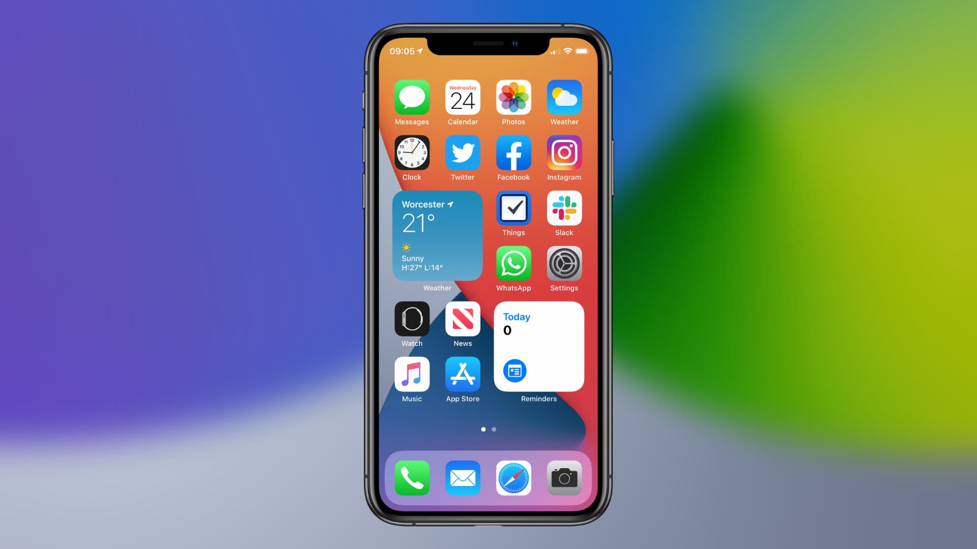
 For many iPhone users, the biggest and most exciting change in iOS 14 is the addition of home screen widgets. It’s a feature we’ve been waiting for for years, and a feature that Android has offered from the start. But there is something you should know before you start using them this fall.
The iOS 14 home screen widgets are not as powerful as you think they are.
There is no doubt that real widgets are a great addition to iOS. The ready-to-use options already prepared by Apple are incredibly useful. And we’ll soon start seeing even more widgets as third-party developers add them to our favorite apps. Plus, widgets are customizable (in some cases) and can be stacked to help tame the chaos of the home screen. ->
IPhone users will also argue that iOS 14 widgets look much nicer than Android ones. They all have the same shape, so they fit seamlessly into the home screen grid, along with all of your apps. Some, like Calendar and Music, even recognize when you’re using Dark Mode and change their appearance to follow suit.
However, there is a huge advantage that Android widgets have over iOS widgets.
New iOS 14 widgets are not interactive
The widgets in iOS 14 currently offer little more than a small snippet of useful information. They can display weather conditions, upcoming appointments, items on your to-do list, and what you’re listening to. But Apple does not make them (or allow them to be) interactive like Google does.
You can’t mark items on your to-do list with the Reminders widget, start a workout with the Fitness widget, or play a track from the Music widget. Tapping them simply opens their respective apps.
“Widgets display relevant and visible content, allowing users to quickly access their app for more details,” explains Apple’s new developer widget guidelines. “Widgets present read-only information and do not support interactive elements such as scroll elements or switches.”
If a developer tries to add buttons, switches, and other interactive objects, Apple’s new WidgetKit framework simply ignores them when displayed on the home screen.
Don’t expect the rules to change
Developers have the opportunity to create up to four sections of their widgets (depending on the size of the widget used) that can be touched. They can be used to establish deep links in applications, to start a certain task, such as composing a new email. But again, it needs to be redirected to the app.
Apple’s own Maps widget provides an example of this. It has two buttons, one of which takes you directly to its built-in search function, while the other automatically finds nearby bars and restaurants. Maps open as soon as you touch them.
Sadly, this is probably not just a limitation of the first beta version of iOS 14, which Apple released after the WWDC 2020 keynote on Monday. It is almost certain that it will not change before the final version of the debut of iOS 14 this fall. The fact that it’s written in Apple’s guidelines, which developers must follow when building and updating iOS 14 apps today, suggests that the rule is in place for now.
That doesn’t mean things won’t be different in a future version of iOS. Apple could make widgets more useful by allowing interactive elements later … but the company could also decide that widgets are sufficient as-is. But at least they are not expensive for Apple Watch; at least developers have the ability to make their own.
Update: Added a paragraph to clarify that developers can make areas of a widget touchable to do a deep link to certain app functions. These lead users to an application to continue their task; it cannot be done from the home screen using the widget alone.